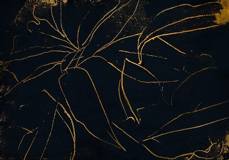
When we look at these curves, intertwining to create an impossible image, doesn’t the picture of a skate park come to mind?
Skilfully playing around with the idea and creating impossible lines has inspired many contemporary architects, and it has also prompted us to explain the importance of colour scales.
When you’re speeding along on four wheels, avoiding distractions and collisions is not something to be taken lightly! And this is our objective today… to generate a visual image that flows in harmony, without creating any aesthetic barriers.
For this, we have chosen our Matt Interiors ecological paints for walls and ceilings in a range of Botanical Greens and Sea Greens that clearly give a touch of adventure to our curvilinear project.
At Coordonné Paints we have a total of 20 shades, whose names are brimming with positivity. Colours such as Laurel, Parra, Oliva, Hierbabuena, Tarifa, Menora and Melón. They are all drenched in the tones of the Mediterranean Sea, which is our main source of inspiration; it is a cradle of talent and provides us with an immensity of aged and elegant hues.
#WALLPAPERISARCHITECTURE


